
Android 16 QPR1 dropped earlier this week and it has had Pixel users cheering due to the first major revamp to Android’s design since Android 12. With Material 3 Expressive, Android 16 QPR1 introduces one of the major redesigns in Android’s history and here’s a quick glimpse of what you can expect from it once it debuts later this year for all Pixel phones or if you decide to install the beta.
Changes to Notifications
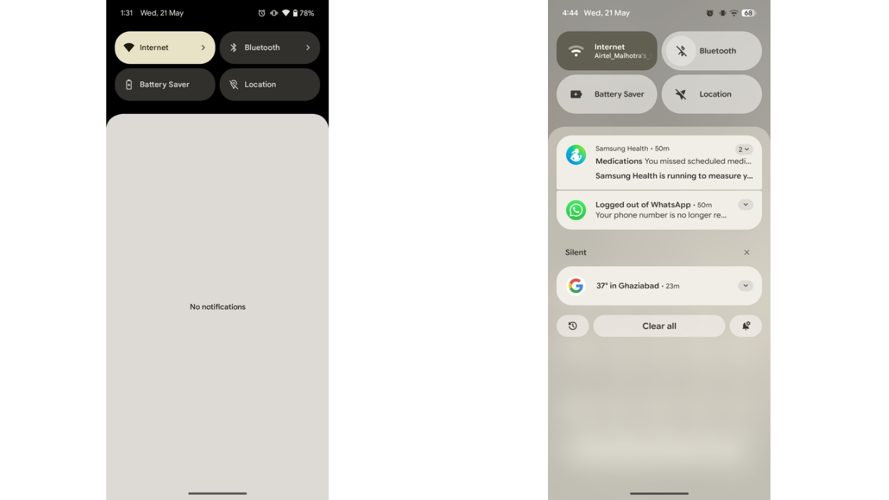
Android 16 QPR1 brings several updates to notifications. A new set of shortcut buttons appears beneath notifications, with a prominent “Clear All” in the centre, flanked by shortcuts to notification history and settings. These buttons vanish when there are no active notifications. Changes to Lock Screen notifications have also been introduced which have been discussed below.
Google also added springy new swipe animations and haptic feedback when dismissing notifications, aiming to deliver a more polished, premium experience.
Quick Settings redesign
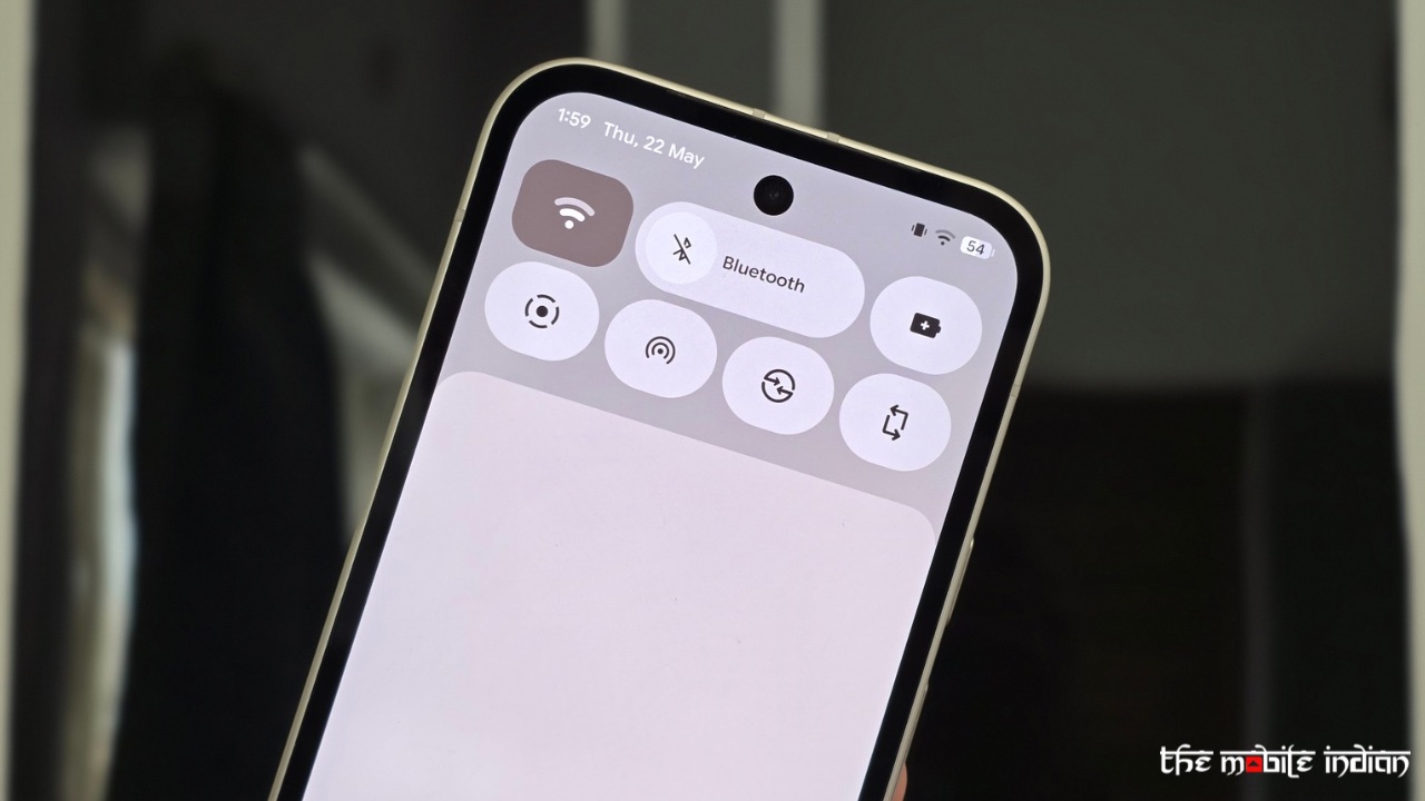
The Quick Settings panel has been completely overhauled. You can now place tiles like how you’d do for apps on the Home Screen as the tiles are now resizable, similar to what we have seen in Nothing OS 3.0.
Once you have changed the tile size, you can place it anywhere in the QS panel as per your liking. Tiles of certain features, such as Do Not Disturb, can now be used to enable the feature with a single tap.
Tweaked Recents Menu
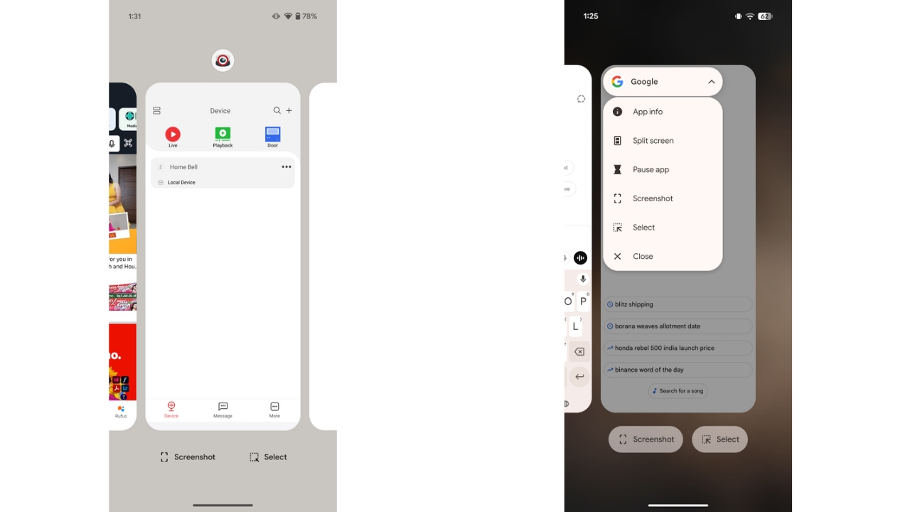
Next, the Recents Menu has been refreshed too. In Android 15, the extended App options were available by tapping the app icon above each preview, but Google hadn’t provided any indication to the user that he/she can do so. Now in Android 16 QPR1, app options in the Recents menu have moved to a more visible pill-shaped button with a drop-down menu. It offers the same options as before but is easier to spot and sits directly on the app preview at the top left corner. The floating icon above the preview has also been removed.
Lock Screen changes
Android 16 QPR1 brings a few key updates to lock screen customization. The clock settings now sit under a dedicated button, replacing the small gear icon previously found under the preview. Further, all the styles appear individually instead of having the user to swipe through each clock style to select the one they need which was Android 15’s implementation.
Further, colour settings are also in the same menu, with a slider to adjust intensity. You still get the default Material You colour and several other choices. Clock size options remain the same—dynamic or small.
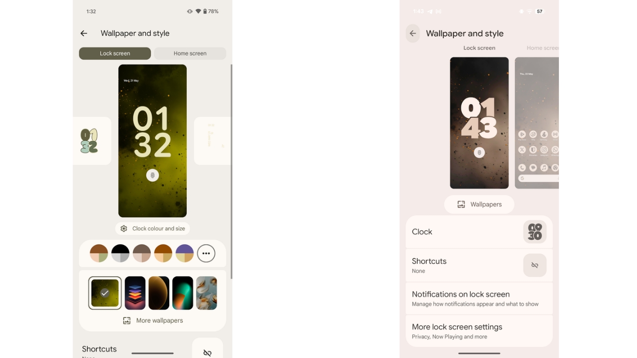
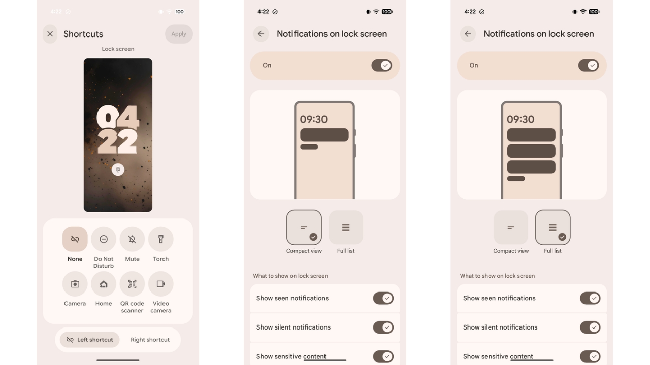
As for notifications, on the lock screen, there’s now a “Compact view” that shows one full notification with icons for others below it. A new “Full list” option displays multiple notifications before collapsing extras into an overflow section. These options are now housed in a full “Notifications on lock screen” settings page (screenshots below), replacing the old pop-up menu. Notification settings on the lock screen have expanded too. Rather than a single toggle, there’s now a full menu with view modes—compact or full—and a new “Show seen notifications” option, which hides alerts after you’ve viewed them.
Lock screen shortcuts have also been improved. Instead of a carousel, there’s now a grid layout, making it easier to choose the option you need. In addition, the lock screen sees a subtle layout tweak as well. The At a Glance widget now sits below the main big clock. When the smaller clock at the corner is active, the day, date, and temperature shift to the right side instead of being below the clock like in the earlier versions of Android.
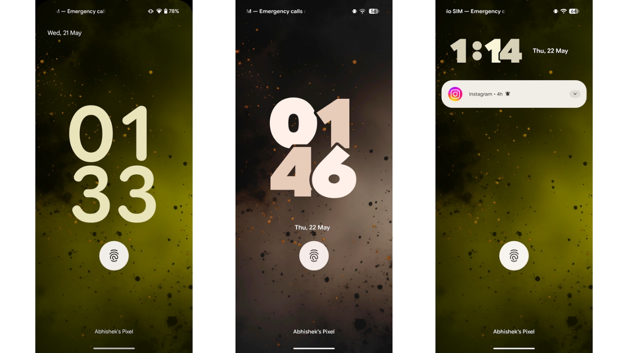
While AOD style hasn’t changed much, it now displays the clock in the accent colour set for the system instead of being white like it was till Android 15. This change was introduced in the previous Android 16 builds.
Read More: Google Pixel 9a Review: It Has Its Charm
New Effects For Wallpapers
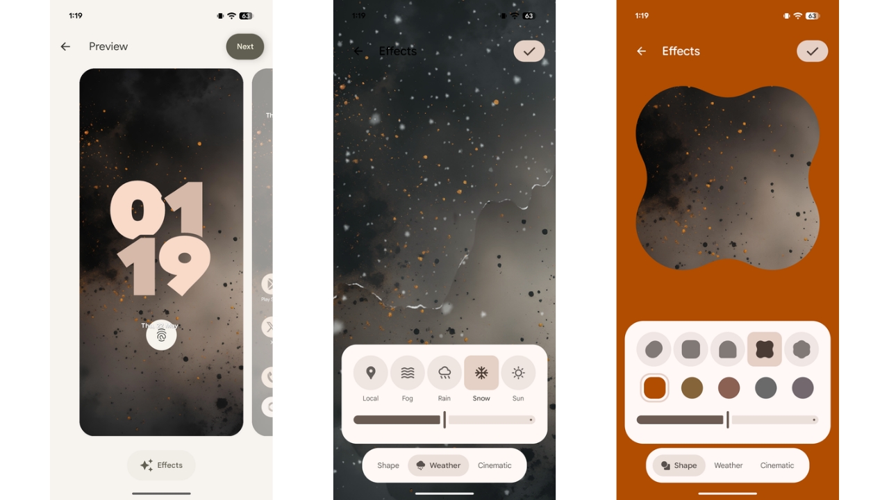
Google has introduced new “Effects” for wallpapers on Pixel devices in Android 16 QPR1. After choosing a photo, an “Effects” button with a sparkle icon appears below the wallpaper. Note that the button appears only with the user’s photos being used for wallpaper and not with the default wallpapers.
Inside the Effects section, you can apply one of three effects. The first is “Shape,” which isolates your wallpaper’s subject and fits it into one of five shapes, with parts often extending outside the frame. This is similar to OxygenOS’ implementation of the same feature. A colour, matching the photo’s palette, surrounds the shape, and a slider lets you adjust its intensity.
The second effect, “Weather,” adds animated overlays—like fog, rain, snow, or sun—on top of your wallpaper. The default “Local” setting syncs these effects with the real-time weather at your location. This weather-based effects for wallpapers have been seen on Samsung phones in the past.
The “Effects” section also now includes Pixel’s “Cinematic” wallpaper, which adds 3D depth to your images. The Cinematic wallpaper feature isn’t new but has been relocated to the “Effects” section.
Settings app redesign
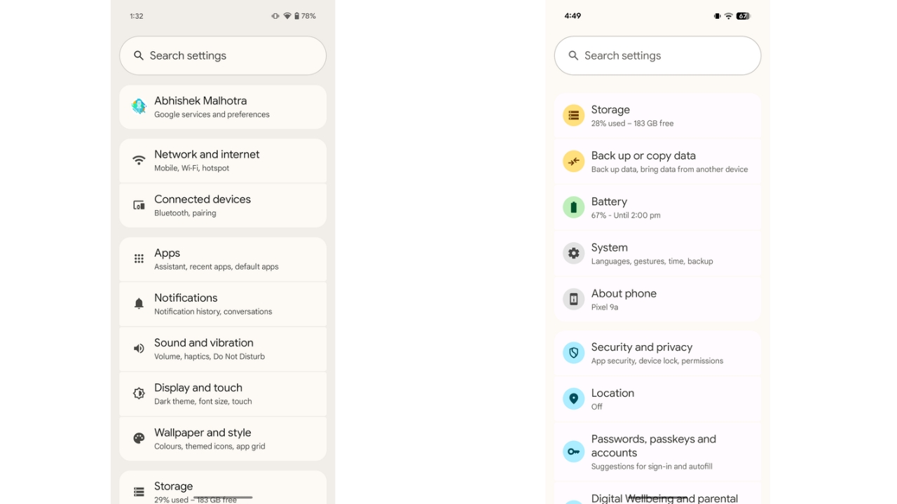
In Android 16 QPR1, the Settings app gets a fresh visual update. Moving away from its old design, each category now features its own pastel coloured icon, with some similar sections sharing hues.
Other Changes, Animations, and Performance
The status bar has also been revamped with new icons for Wi-Fi, Signal, Battery, Vibrate, and more. They look more modern and seem to have taken inspiration from Apple’s status bar. Further, some animations have also changed such as the one while closing apps where the blurring of the Home Screen wallpaper is now more prominent while the morphing of the icon shape has also been tweaked slightly. Blur has also been added in the background in various places across the UI, such as while using the notification shade, app drawer, and more.
The App drawer animation has also changed in Android 6 QPR1 which I am not a big fan of. It doesn’t match the vibe of the rest of the user interface and as of now, isn’t even smooth. Moreover, the app drawer now opens with a Sheet UI with an outline on top instead of the full screen user interface we were used to seeing. Private Space is still at the bottom of the app drawer like before and is opened with a slow animation after you unlock it.
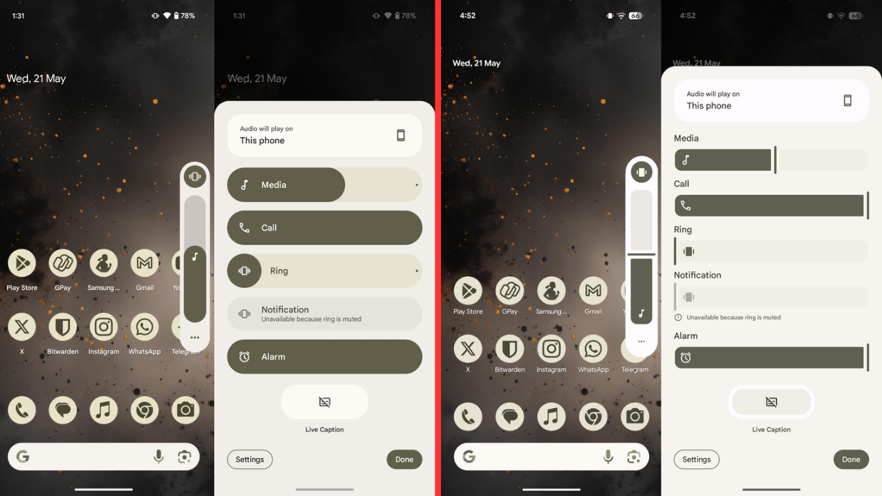
The animation while changing the sound mode from the volume bar has also changed and now shows a stretchy effect after the mode has been changed. The rest of the volume bar user interface has also been refreshed entirely with a new line at the end of the bar to denote the current volume level instead of the normal curved end that was in use before.
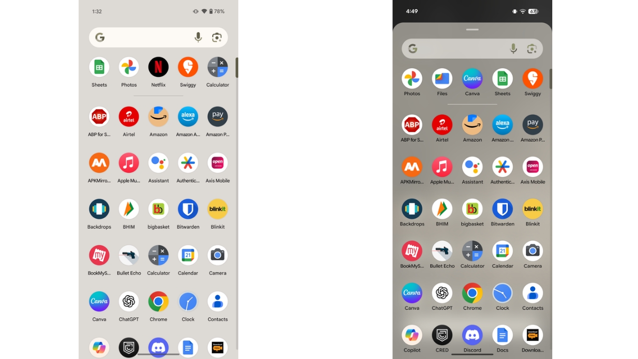
Then on the Home Screen, the space the “At a glance” widget takes has reduced, allowing user to place one more row of apps. The widget still can’t be removed, though.
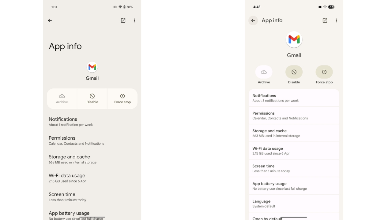
The dynamic wallpaper-based colour theming is now applied to different parts of the system user interface compared to before. Finally, the app info page has also been tweaked. You now see more options on the screen, thanks to the App Info header size being reduced. The buttons for Archive, Disable, and Force Stop have now been separated.
Aside from these changes, I haven’t seen any performance improvements in Android 16 QPR1 on the Pixel 9a for now. Instead, I was noticing some lag across the user interface with a few glitches but that’s normal as this is still a beta and a stable build is scheduled to come out later this year, likely around September or October, which will polish things up. There was no abnormal heating during my use and neither did I face any major issues that would render the device unusable.
Overall, Android 16 QPR1 has introduced welcome changes with a UI revamp that was much needed for Android on Pixel. The updated animations, icons, and colour scheme in Android 16 QPR1 give the system a fresh, modern look with a cool, refined vibe. We’ll see what additional changes Google will introduce in the upcoming updates and at the end, which one of these will make their way to the stable build.