Home Blog Page 106

Game Changer: Epic has Forced Google to Open Play Store to Rival App Stores, Wins Major Antitrust Lawsuit

0

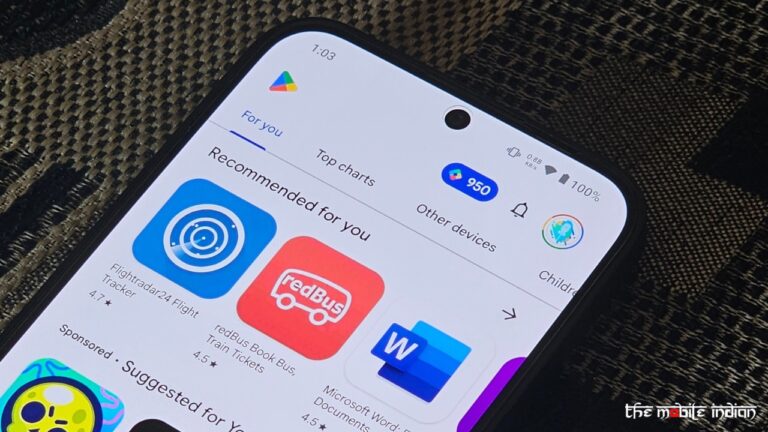
Epic has forced Google to open to rival app store as it has scored a major win against the tech giant in an antitrust lawsuit. This verdict mandates that Google must allow third-party app stores, such as the Epic Games Store, to be accessible directly from the Google Play Store.

As a result of the lawsuit ruling against Google, it is required to allow rival third-party app stores access to its full catalog of Google Play apps, unless developers specifically choose to opt out. This policy means that unless developers actively decide not to participate, their apps will be made available on other app stores beyond Google Play. The jury’s decision applies to Google for three years, starting November 1st, 2024, and ending November 1st, 2027. From this November, Google must:

  • Stop mandating the use of Google Play Billing for apps distributed on the Google Play Store (the jury ruled that Google had unlawfully tied its payment system to its app store)
  • Allow developers to inform users about alternative payment methods within the Play Store
  • Permit Android developers to provide links for downloading their apps outside of the Play Store
  • Enable Android developers to set their own app prices, independent of Google Play Billing

Google will retain a degree of control over safety and security as it opens the Google Play Store to rival app stores. The injunction allows Google to “take reasonable measures” that are “strictly necessary and narrowly tailored,” similar to how it currently manages security on the Play Store. Additionally, Google is permitted to charge a fee for these security measures.

Google is also prohibited from:

  • Sharing app revenue with any individual or entity that distributes Android apps or plans to launch an app store or app platform
  • Offering developers financial incentives or perks to launch their apps exclusively or first on the Play Store
  • Offering developers financial incentives or perks to avoid launching their apps on rival app stores
  • Offering device manufacturers or carriers money or perks to preinstall the Play Store
  • Offering device manufacturers or carriers money or perks to avoid preinstalling competing app stores

Google has been given eight months by the judge to develop a system as suggested by jury. The system should also provide developers with an option to opt out of having their apps listed in competing Android app stores.

While Epic Games scored a major win, it didn’t get everything it wanted. These demands included a six-year opening of Google Play to third-party app stores, rather than three; a one-tap process for users to sideload apps, over which it sued both Samsung and Google last week; and an end to Google’s ability to link Android APIs to Google Play.

Explaining why the jury didn’t order Google to open up the Play Store for six years, the judge said in his order, “The provisions are designed to level the playing field for the entry and growth of rivals, without burdening Google excessively.” “As competition comes into play and the network effects that Google Play unfairly enjoys are abated, Google should not be unduly constrained as a competitor.”

Epic Games still considers this a notable victory. “The Epic Games Store and other app stores are coming to the Google Play Store in 2025 in the USA — without Google’s scare screens and Google’s 30% app tax — thanks to victory in Epic v Google,” Epic Games CEO Tim Sweeney said in a post on X.

Read More: Epic Games wins antitrust lawsuit against Google over Play app store

Google’s Response to the Verdict

In a blog post, Google said it will appeal the Epic Games verdict. “The Epic verdict missed the obvious: Apple and Android clearly compete. We will appeal and ask the courts to pause implementing the remedies to maintain a consistent and safe experience for users and developers as the legal process moves forward,” said Google in a blog post.

Google believes that these changes would put “consumers’ privacy and security at risk, make it harder for developers to promote their apps, and reduce competition on devices.” “Ultimately, while these changes presumably satisfy Epic, they will cause a range of unintended consequences that will harm American consumers, developers and device makers”, noted the company.

The decision further fails to take into account that Android is an open platform and developers have always had many options in how to distribute their apps, according to Google. The company says that developers have other options too, such as offering their apps directly to users from their websites. For example, Epic Games has made its popular Fortnite app available to Android users through the Samsung Galaxy Store, sideloading, and the Epic Games Store – all while Fortnite was not distributed through Google Play.

You Can Now Send Video Messages on Google Chat; Voice Message Transcription Also Added

0

Google has announced that users can now send Video messages on Google Chat, along with the ability to auto transcribe voice messages sent on the communication platform. The automatic transcription of voice messages will be available to Google Chat users both on the web and mobile.

”Starting today, users will be able to see an automatic transcription of voice messages in Chat on web and mobile,” said Google in a Workspace updates blog post. This update enables content consumption in a user’s preferred format or the format that is most convenient at that particular moment. 

Google notes that this feature will be ON by default and can be disabled at the domain or OU level by disabling all attachments. Further, end users can send voice messages on mobile (to direct messages, group chats and spaces) and receive them on all platforms, including web.

To review the voice messages transcription, click “View transcript” underneath the voice message. You can close the voice transcription by clicking “Hide transcript”.  For screen reader users, voice transcripts are treated as readable texts.

The voice message transcription feature in Google Chats will be available to all Google Workspace customers and Google Workspace Individual subscribers. It has already begun rolling out to users on web, Android, and iOS.

Video Messages on Google Chat

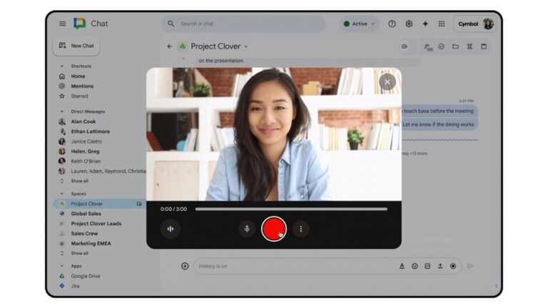
In a separate post, Google announced that it is introducing video messages on Google Chat, “a new capability that helps you save time, convey more information, add tone or emphasis, and can be useful in a number of scenarios.” Google also highlights some of the use cases of Video messages, such as:

  • Sales or customer support team members sending video updates about new features or account changes. 
  • Executives sharing company-wide announcements or strategic updates, fostering transparency and engagement across the organization. 
  • Team members sending a video with outstanding updates in lieu of attending a live meeting.

Google notes that a Video message cannot be recorded on ChromeOS, Linux and Firefox browsers and operating systems. In the future, just like transcription of voice messages, Google also plans to add transcription services to video messages.

To record a video message, select the record button in the Chat compose box and click “video message.” Then simply record your message and press send. You can preview or re-record your video before sending your video message and you can send video messages in individual chats, group DMs, and spaces, and they can be interacted with (quoted, reacted to, replied to in thread, etc) just like any other Chat message.

Video messages will be stored in the Media section of the Shared tab. You can send video messages on web and receive them on all platforms. The ability to record and send video messages on mobile is not available yet. Video messages on Google Chats are available for Google Workspace consumers including:

  • Business Starter, Standard, Plus 
  • Enterprise Standard, Plus 
  • Essentials Starter, Enterprise Essentials, Enterprise Essentials Plus 
  • Nonprofits 
  • Frontline Starter, Standard 

Google Might Place a Gemini Button on the Android Lock Screen

0

Google wants you to make use of Gemini as much as possible and has continued to integrate it in each of its services. A seamless Gemini integration is now being developed at Google for Android, where the company might place a Gemini button on the Android lock screen so users instantly access the AI-powered assistant.

As found by Mishaal Rahman (via Android Authority) in Android 15 QPR1 Beta 2, there is a flag that enables a new way to invoke the default assistant, i.e. Gemini, on Android devices. This flag determines whether a button appears on the lock screen. Currently, tapping the button has no effect.

The button itself is pill-shaped and positioned directly below the fingerprint reader. It’s noticeably larger than the two lock screen shortcuts located at the bottom of the screen. At its center, there’s a sparkle icon, making it stand out visually. The sparkle icon, nowadays is usually associated with AI-powered applications, and in Google’s case, it denotes Gemini.

The new Gemini button on the Android lock screen could help users instantly access Google’s assistant without even unlocking the phone. However, Rahman couldn’t make out “what the button is actually supposed to do or if it’s actually something that Google intends to ship.” There’s a possibility that this button exists for Google engineers to purely experiment with upcoming AI features in Android 16 and not ship it in the stable build of Android.

As for Android 16, a report from the same publication last month suggested that the next version of Android will bring a major redesign for the quick settings panel. In the new panel, swiping once still brings down the notifications panel like the current implementation, but the panel now takes up about a quarter of the screen rather than the entire display. Further, you can no longer see any Quick Settings tiles in the new notifications dropdown. On the other hand, the you are using before you swiped down the panel is visible in the bottom half of the screen.

Apple Swift Student Challenge 2025 Applications to Open in February

The Apple Swift Student Challenge offers students worldwide a unique platform to demonstrate their creativity while building practical, real-world skills. Through this challenge, students are empowered to join a global community of developers using Swift, the programming language employed by professionals to create innovative apps. The company has now announced that the applications for Apple Swift Student Challenge 2025 will open in February next year.

The Swift Student Challenge initiative not only encourages young minds to explore coding but also fosters the development of ideas that could lead to the next generation of groundbreaking applications. It’s an opportunity for students to gain hands-on experience with industry tools and showcase their talents on a global stage.

Submissions for the 2025 Swift Student Challenge will open in February for three weeks. Students, educators, and their advocates can find out how to prepare for the challenge and sign up to be notified when applications open at developer.apple.com. Apple will recognise a total of 350 Swift Student Challenge winners whose submissions demonstrate excellence in innovation, creativity, social impact, or inclusivity.

Read More: Apple iPhone 16 Review: Is Camera Control Appealing Enough?

From this esteemed group, 50 Distinguished Winners will receive additional recognition and be invited to Apple’s headquarters in Cupertino next summer. Apple is also unveiling updated Swift Coding Club resources to help students prepare for the Swift Student Challenge, while building community and developing skills for a future career.

The Swift Coding Club starter kit provides activities to empower students with a passion for app development to further explore Swift and SwiftUI and spread the word among their peers. “In addition, new Develop in Swift Tutorials offer students a great first step toward a career in app development using Swift, SwiftUI, and Xcode — Apple’s integrated development environment — as they build innovative apps for all Apple platforms,” says Apple.

MediaTek Dimensity 9400 3nm SoC Announced: Check Details

MediaTek today launched the Dimensity 9400, the company’s new flagship smartphone optimized for edge-AI applications, enhanced gaming and photography, and more. The Dimensity 9400, the fourth and latest in MediaTek’s flagship mobile SoC lineup, offers a boost in performance with its second-generation All Big Core design built on Arm’s v9.2 architecture.

MediaTek Dimensity 9400: Specifications

The Dimensity 9400 adopts MediaTek’s second-gen All Big Core design, integrating one Arm Cortex-X925 core operating over 3.62GHz, combined with 3x Cortex-X4 and 4x Cortex-A720 cores. This design offers 35% faster single-core performance and 28% faster multi-core performance compared to MediaTek’s previous generation flagship chipset, the Dimensity 9300. Built on TSMC’s second-generation 3nm process, the Dimensity 9400 is up to 40% more power-efficient than its predecessor, claims the chipmaker.

It packs MediaTek’s 8th Generation NPU, and is the first mobile chipset to offer on-device LoRA training, high-quality on-device video generation, and developer support for Agentic AI. The Dimensity 9400 allegedly offers up to 80% faster large language model (LLM) prompt performance while also being up to 35% more power efficient than the Dimensity 9300.

The MediaTek Dimensity 9400 also integrates MediaTek’s new Dimensity Agentic Engine (DAE), which is designed to turn traditional AI applications into sophisticated agentic AI applications. MediaTek is working with developers to offer a unified interface between AI agents, third-party APKs, and models that efficiently run both edge AI and cloud services. This streamlined approach allows models to work with many different third-party APKs, which reduces development time and will help bring in a new ecosystem of agentic AI applications.

The chip further employs the 12-core Arm Immortalis-G925 with up to 40% faster raytracing performance compared to the previous generation. The Dimensity 9400 also brings PC-level features to smartphones with opacity micromaps (OMM) support for realistic effects.

MediaTek also announced yesterday that the chip is optimised to support multimodal Gemini Nano AI model by Google. By enabling multimodal models, MediaTek says that users will be able to take images and receive detailed descriptions of what’s been captured.

The chipset’s GPU also offers 41% peak performance boost with up to 44% power savings compared to the Dimensity 9300, allowing users to game for longer. Additionally, the Dimensity 9400 supports HyperEngine technology for super and impressive picture quality, which is co-developed by MediaTek and Arm Accurate Super Resolution (Arm ASR).

It gets MediaTek Imagiq 1090 ISP, enabling HDR video recording throughout the entire zoom range, MediaTek’s Smooth Zoom technology to capture moving subjects, and more. Additionally, it is designed to minimize power consumption while users are taking photos and videos, offering up to 14% lower power consumption in 4K60 video capture compared to the Dimensity 9300.

For connectivity, there’s a refreshed 3GPP Release-17 with 4CC-CA and up to 7Gbps sub-6GHz performance, a new 4nm Wi-Fi/Bluetooth combo chip with 7.3Gbps data rates performance and up to 50% lower power consumption compared to the previous generation, support for Wi-Fi 7 tri-band MLO, MediaTek Xtra Range 3.0, and 5G/4G Dual Dual Active support.

MediaTek Dimensity 9400 Powered Smartphones

The chip brings support for tri-fold smartphones as well. Meanwhile, MediaTek says that the first smartphones powered by the MediaTek Dimensity 9400 will be available in the market starting in Q4 of 2024. The Vivo X200 series as well as the OPPO Find X8 series devices will be the first set of smartphones to come employed with this SoC. The Vivo X200 series is all set to launch on October 14, as confirmed by the brand itself.

Tecno Spark 30C 5G Launched in India: Should You Consider it?

0

Tecno has announced the launch of Tecno Spark 30C 5G in India at a budget price point, where the device comes powered by a MediaTek Dimensity chipset, paired with a two-camera setup on the back, flash on the front, and much more. Here’s everything to know about the device and whether you should buy it or not.

Tecno Spark 30C 5G: Price, Availability

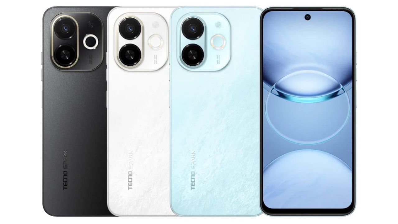
The Tecno Spark 30C 5G comes in Midnight Shadow, Aurora Cloud and Azure Sky colours while buyers will also receive an additional back panel skin in the box. It is priced at Rs 9,999 for the 4GB + 64GB trim and Rs 10,499 for the 4GB + 128GB model. There’s a Rs 1,000 bank offer buyers can avail, while purchasing the device from Flipkart.

Tecno Spark 30C 5G: Specifications

Tecno spark 30c 5g colours

Tecno Spark 30C 5G sports a 6.67-inch 720 x 1600 pixels LCD screen with 120Hz refresh rate, and a 263 ppi. It is powered by the MediaTek Dimwnsity 6300 5G Processor with 4GB RAM and up to 128GB storage which is expandable via a card.

There’s a 48MP Sony IMX582 primary sensor on the back, paired with an AI sensor and a triple-LED flash. On the front, it gets an 8MP sensor for selfies also with dual-LED flash. The device also has stereo speakers and is IP54 rated. It packs a 5000mAh battery with 18W fast wired charging.

Connectivity options on the device include 5, v5.1, GPS, 4G LTE, NFC, a 3.5mm audio jack, and a USB-C port for charging. It runs on Android 14-based HiOS out of the box, and also has a side-mounted fingerprint sensor for biometrics.

Read More: Tecno Spark 30 Series Launched: Check Details

Tecno Spark 30C 5G: Should you buy it?

The Spark 30C 5G looks like a rebranded Pop 9 5G smartphone which the brand launched earlier in September. However, the Pop 9 5G is priced starting at Rs 9,499 which saves you 500 bucks on both the variants of the handset.

If you want to steer away from Tecno, you could consider the Samsung Galaxy M15 5G for Rs 10,999, where you would get a inferior chipset, but you are offered a better camera setup, a bigger battery, a more polished software experience where you are offered 4 years of OS updates, and a superior display.

Overall, we’d say you should skip the Tecno Spark 30C 5G and explore other options in the market, including those from Tecno itself, and other brands like Samsung and Motorola.

Nothing OS 3.0 Open Beta Announced for Phone (2a); Check Rollout Timeline for All Nothing, CMF Phones

0

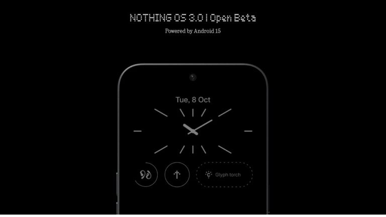
Nothing 3.0 Open Beta has been announced by Nothing for all of its smartphones, including the CMF Phone 1 from its sub-brand. Nothing OS 3.0 is all set to release in December later this year and ahead of the general release, the brand is running an Open Beta program to iron out any bugs from the software on the basis of feedback received from users.

Nothing OS 3.0 Open Beta: Rollout Timeline

As announced on Nothing Community, the Nothing OS 3.0 Open Beta is now available for the Nothing Phone (2a). The rollout timeline for all Nothing and CMF devices is as follows:

  • Phone (2): November 2024
  • Phone (1): December 2024
  • Phone (2a) Plus: December 2024
  • CMF Phone 1: December 2024

Nothing OS 3.0 Open Beta: What’s New?

As for the full changelog of what’s new in the update, it’s as follows:

Lock screen

  • New lock screen customisation page. Access by long-pressing the lock screen.
  • Upgraded clock faces. Choose your favourite style.
  • Expanded widget space, allowing you to place more widgets on your lock screen.

Smart Drawer

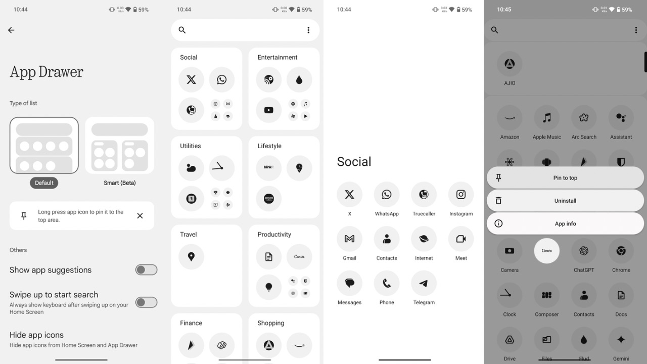
  • Added AI-powered Smart Drawer feature to automatically categorise your apps into folders. For better organisation and easy access.
  • For ultimate convenience, you can your favourite apps to the top of the drawer. No scrolling required.

Quick Settings

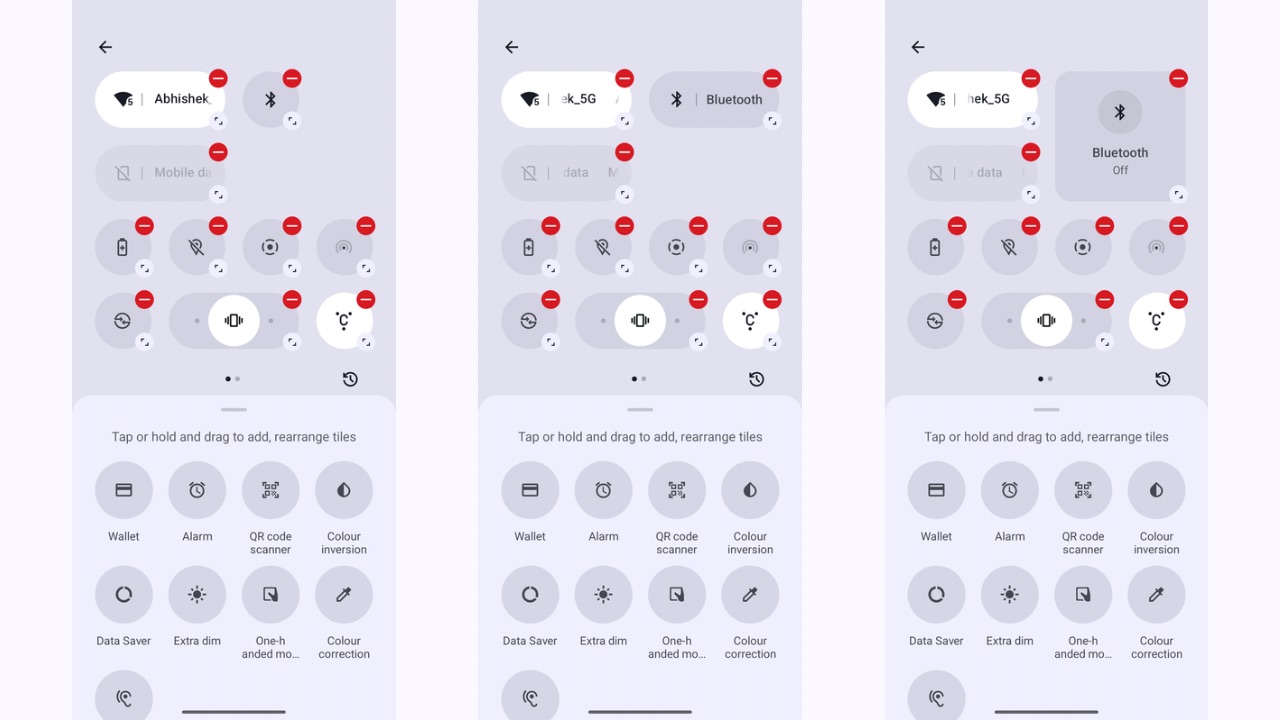
  • Reconsidered Quick Settings design with an optimised editing experience.
  • Enhanced widget library design.
  • Updated visuals in Settings including better Network & Internet and options.

Camera improvements

  • Faster camera launch speed under the Camera Widget.
  • Reduced HDR scene processing time.
  • Optimised portrait effects by fine-tuning blur intensity based on face size.
  • Boosted camera performance in low-light environments.
  • Improved zoom slider display.

Enhanced pop-up view

  • Movable pop-up view for cleaner and more productive multi-tasking.
  • Easily resize the pop-up view by dragging the bottom corners.
  • Pin the pop-up view on the screen for quick access.
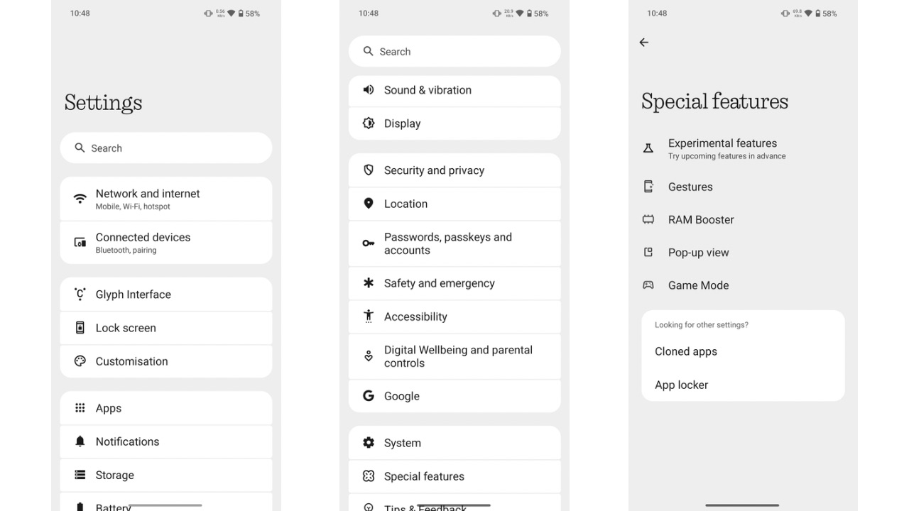
  • View information without leaving your current app. Simply swipe down on incoming notifications to enter the pop-up view. Enable via Settings > System > Pop-up view.
  • New fingerprint animation with signature dot matrix styling.

Other improvements

  • Added support for auto-archive function to automatically free up storage space without removing apps or data from your device.
  • Partial screen sharing for more efficient and secure screen recording. Record just an app window rather than the entire screen.
  • Updated setup wizard to version 3.0 for the smoothest introduction to Nothing OS.
  • Enabled predictive back animations for apps that have opted in.

We have already tested out these changes on our unit of the Nothing Phone (2a) running on Nothing OS 3.0 Open Beta, so do check that out before installing the latest software version from the UK-based brand.

Nothing OS 3.0 Overview: Superficial or Big Changes?

0

Carl Pei founded Nothing in 2021, and the brand has been consistently experimenting with design and user interface. While some of these experiments have been well-received by consumers, others have not. Today, I want to discuss Nothing OS, which is a feature that retains the core of but adds a custom skin with essential customization features. Now, Nothing is introducing Nothing OS 3.0, which completely overhauls the software’s design and incorporates Nothing’s signature elements, including the dot matrix font that the company has used since its beginning. The first public beta of Nothing OS 3.0 is now available for the Nothing Phone (2a), and I’ll provide an overview of this new software version from Nothing, which is based on Android 15.

Nothing os 3.0 widgets tray

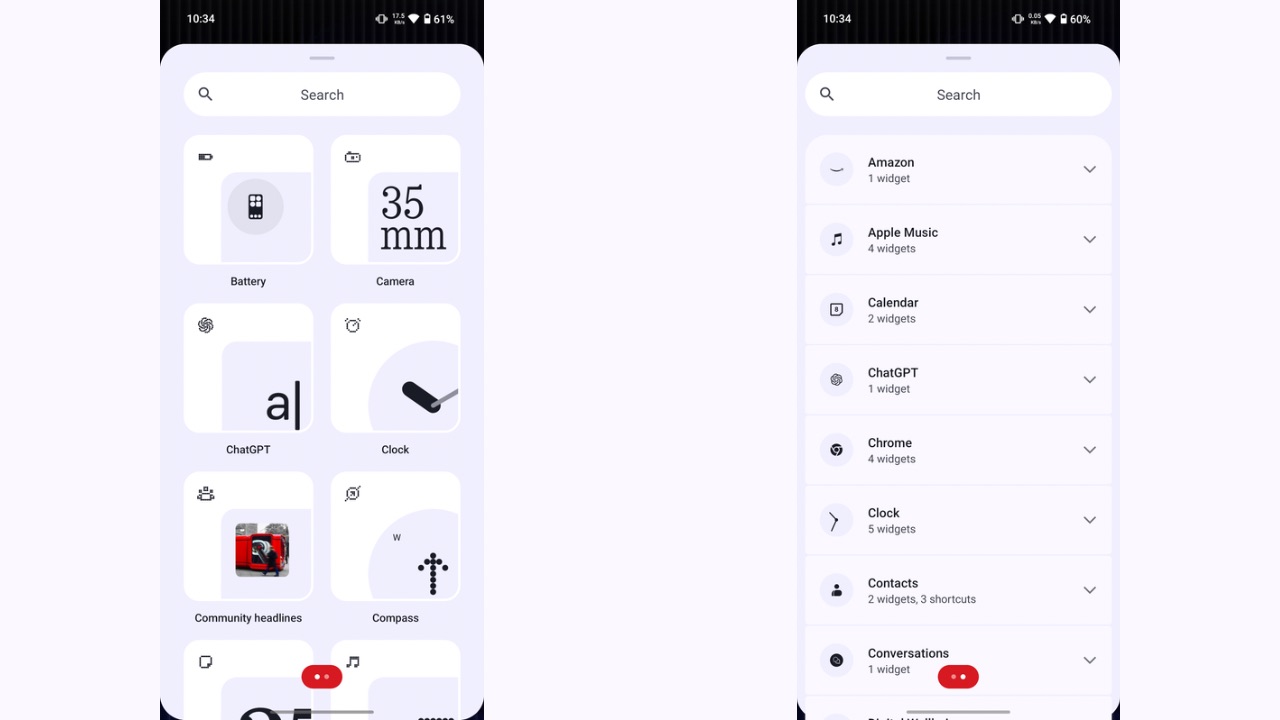
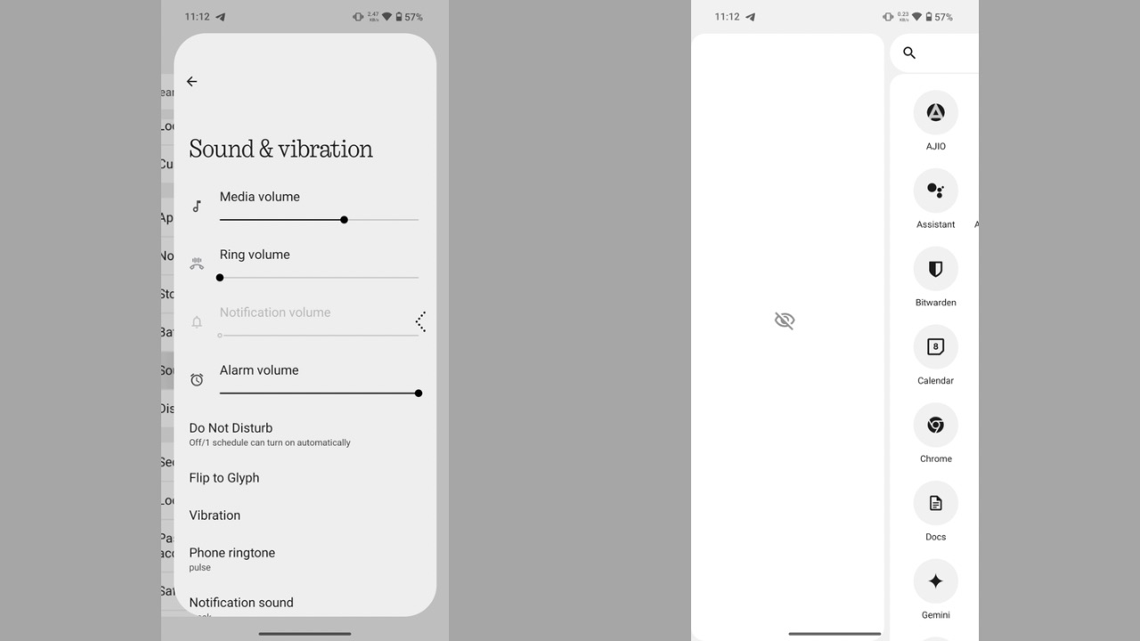
Starting off with the home screen, not a lot has changed in terms of the user interface, except for the Widgets tray, which has been completely redesigned. The new widgets tray is now separated in two pages, where the first page shows all the first-party widgets by Nothing while the second one shows the widgets from third-party apps. The design of Nothing’s own widget previews has also changed in Nothing OS 3.0, with an off-centre preview, along with the icon of the app the widget is from, placed at the top-left corner of the widget.

Nothing OS 3.0 quick settings panel

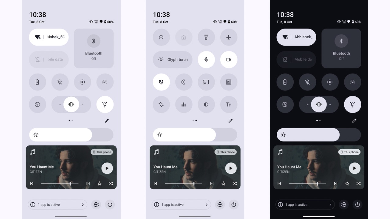
The next major change you’ll notice is the reworked quick settings panel which completely deviates from the Stock Android quick settings panel we see in Pixel devices and the previous versions of Nothing OS. The huge pill-shaped tiles have now been replaced with regular round icons of quick settings, where each can be resized as well. When expanded, the quick setting for ring mode acts as a slider to toggle between ring, vibrate, and silent modes, which is quite a unique implementation.

Nothing OS 3.0 quick settings customisation

Instead of the six tiles earlier, you can now place up to eight tiles when non-expanded and see up to sixteen when the panel is expanded further. Further, the colour scheme of the quick settings panel has also been redesigned in Nothing OS 3.0, wherein in light mode, it is completely white and in dark mode, the dark grey and black colours take over. This is unlike the previous implementation, in which only the bottom half of the notifications panel changed its colour to dark and light modes.

Nothing OS 3.0 smart app drawer

Next, the new smart app drawer in Nothing OS 3.0 is identical to that of iOS’ app drawer. It intelligently groups your apps into various categories. The smart app drawer is a neat addition, but we felt it still requires some improvement to categorize apps better. Apps like Samsung Internet were placed under the Social category, whereas they should have been under the utility category, similar to Chrome. Additionally, in the default app drawer, you can now pin apps in the top row for quick access to your choice of apps, such as the ones you use the most but don’t want on the home screen.

Read More: Nothing Phone (2a) Plus October 2024 Security Patch Update Rolling Out With Bug Fixes

Nothing OS 3.0 redesigned settings app

The Settings app is now well put together in Nothing OS 3.0 with better categorisation. Network settings have been grouped, followed by customisation, system settings, etc. The header fonts across the Settings, where the dot matrix font was used earlier, have also been replaced with a new Roboto font.

Nothing OS 3.0 device diagnostics

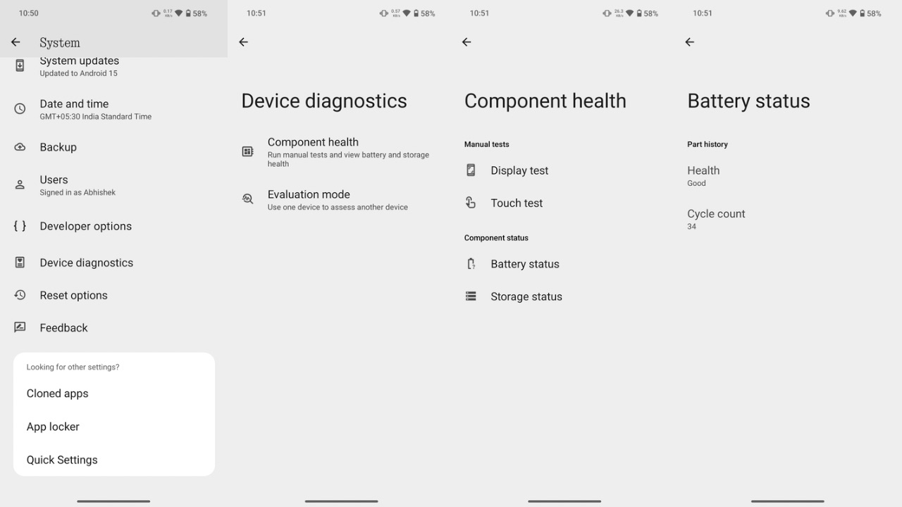
Then, in Settings, you can also find a new Device Diagnostics option where you can check the health of various device components, such as the battery, charging cycle count, display test, storage test, and touch test. Battery health isn’t specified in terms of percentage but only described in text, such as showing Battery health as “Good” in my case.

Nothing OS 3.0 predictive back

Some Android 15 features have also been implemented, such as the predictive back animation, where you can see where the back gesture will take you when you trigger it. While we couldn’t find the Private Space feature like in the Android 15 beta on Pixel devices, you can still hide apps from the app drawer by swiping towards the right in the app drawer. Other Android 15 features that are a part of the update include auto App archiving, and partial screen recording.

Nothing OS 3.0 lock screen widgets shortcuts

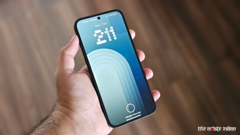
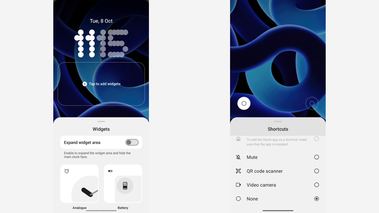
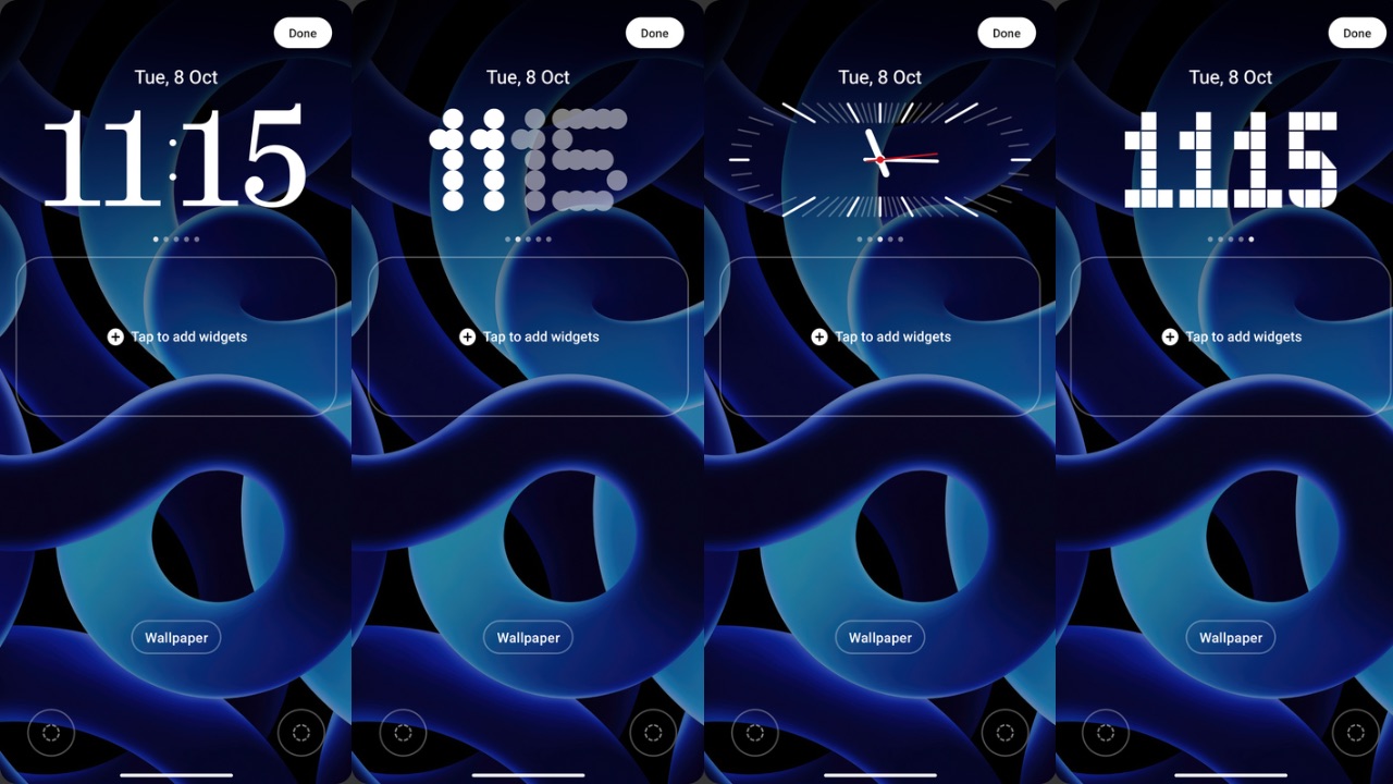
Lock screen customisation is another new aspect Nothing has worked on in Nothing OS 3.0. Once you tap and hold on the lock screen, a new “Customise Lock Screen” button appears at the bottom. Tapping on it takes you to the screen where you can choose and customise the lock screen shortcuts at the two bottom corners, and choose from five new clock styles. I would have also liked it if these same settings were accessible from the Lock screen section in the Settings app, but unfortunately, you can’t. Further, you can now “Expand Widget area” on the lock screen that hides the clock face and gives widgets the front seat. 

Nothing OS 3.0 clock styles

All these clock styles have been designed to appear at the top of the lock screen, and the previous design, where the dot matrix clock was positioned in the center, has been scrapped altogether. The new fonts for clocks, however, look better and more appealing than the previous one.

Moreover, the clock style you choose also carries over to the Always-on display so there’s some level of AOD customisation, too. There’s also a new dot matrix-inspired fingerprint animation, which replaces the ordinary-looking circle animation we were used to seeing in previous versions of Nothing OS.

Other user interface elements, such as the Glyph lighting features and their Settings UI, the home screen customisation and features, the camera app, etc., remain unchanged from previous versions.

Overall, the animations of closing and opening apps remain identical. System fluidity also looks similar, if not better. I could notice some bugs as well, such as the flickering of the lock screen when AOD triggers, the inconsistent unlocking animation when using the fingerprint to unlock, and some frame drops in the user interface. Because it’s a beta build, these bugs are expected and should be ironed out in future releases.

Future releases should also bring the new Gallery app Nothing has teased, as it isn’t a part of the first public beta. The new charging animation that was shown in the launch video is also not yet available.

What I’d also like to see in future releases is some more options I am used to in other Android skins, like double-tap on the lock screen to wake up the screen, which would add further value to the software.

Overall, I am quite impressed with Nothing’s effort in Nothing OS 3.0 as it clearly shows the brand’s aim to distinguish its software from the other players. As of now, it looks like a step in the right direction.

MediaTek Dimensity 9400 SoC Will Support Multimodal Gemini Nano

0

The upcoming from MediaTek, dubbed MediaTek Dimensity 9400 SoC, will have support for multimodal Gemini Nano model by Google, as confirmed by the chipmaker. The Dimensity 9400 is all set to launch tomorrow, October 9, while devices powered by it should also come later this month.

MediaTek announced that Dimensity Platforms are now optimised to support Google’s Gemini Nano with new multimodal capabilities. This includes the upcoming Dimensity 9400 flagship mobile chipset set to launch this month and other Generative AI-enabled chipsets. “The upcoming Dimensity 9400 features a new 8th generation NPU with hardware acceleration for text, image, and speech”, said MediaTek in a blog post.

“MediaTek’s partnership with Google highlights a shared vision for bringing Generative AI experiences across the ecosystem, and is a big step forward in the advancement of complex AI models running on-device,” added MediaTek. By enabling multimodal models, MediaTek says that users will be able to take images and receive detailed descriptions of what’s been captured.

Read More: MediaTek Dimensity 9400 SoC: What Do We Know About It?

Gemini Nano is Google’s AI model optimised for smartphones and other devices, allowing them to run on-device multimodal generative AI applications with or a data without network, such as Google’s Circle to Search feature, which expanded to the Xiaomi 14T series and the Xiaomi MIX Flip recently.

As for the upcoming MediaTek chip, details about it have leaked multiple times before, with the latest leak suggesting that the MediaTek Dimensity 9400 SoC reportedly delivers a noticeable 86% better performance over Apple’s A18 Pro chip found in its latest iPhone 16 Pro models.

Still Not Sold: Why I’m Steering Clear of Foldable Smartphones for Now

0

Foldable smartphones, with their futuristic designs and multi-functionality, are marketed as the next evolution in mobile technology. However, despite the buzz surrounding them, I remain unconvinced about their practicality and appeal, at least for the next few years, due to my own personal experience with a Galaxy Z Flip 4 from Samsung and also because of the experiences of people around me owning a foldable.

One of the biggest issues in foldable, to date, is durability. No matter the IP rating of these foldables, and even if they haven’t been near water, the display is likely to fail at some point during their lifetime, something my experience tells me.

Samsung has been making foldables and commercially selling them since 2019 and the brand has always tried to perfect the process of creating a foldable. Despite those measures being adopted, my Galaxy Z Flip 4 died about a year ago in September 2023, shortly after it came out of its warranty period in August 2022, and all of it began happening after an update. The device met a gradual demise, starting with the display suddenly glitching, turning green and flickering uncontrollably.

The final nail in the coffin was when the device would just shut down as soon as it got folded. The Samsung service centre handed me over a bill of around Rs 33,000 to completely replace the inner foldable display because it was out of warranty, and despite telling them that the device hadn’t been near water or hadn’t fell even once which they could see as the device didn’t have any damage apart from minor wear and tear whose cause was the case I was using with the device.

Read More: Samsung Galaxy S24 FE, Galaxy Tab S10 Series Announced With No Base Model Tab S10

Fortunately, I got it repaired from another Samsung service center, where I personally knew an employee who had to merely replace a part inside the device, which they referred to as “Flex cable. ” This somehow also solved the device’s wireless charging problem, which had also stopped working. What did it cost? Rs 2,000. Yes, you heard that right.

After an official repair, the device worked well for about five months. Then, the screen protector began to show bubbles within the area of the crease, and before I could get it replaced, the display died once again. This time, it was the display that was faulty, not the cable that got repaired earlier, even though the device didn’t fall or get wet once after the repair. A bill of Rs 33,000 again stood on top of my head.

Now, the same device is sitting as a paperweight in my drawer, as I chose not to get it repaired and instead get a OnePlus Nord 4, which actually cost me the same as the display repair cost of the Galaxy Z Flip 4.

As if that wasn’t enough, two of my relatives have had the exact same issue with their Samsung foldable, all within the last two months. Coincidentally, both of them also had a Galaxy Z Flip 4.

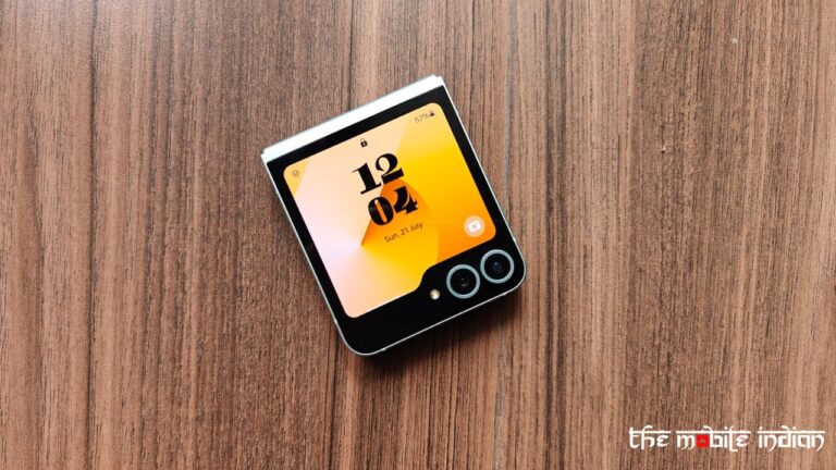
While I definitely liked the Galaxy Z Flip 6’s design, note that even my Flip 4 worked without any issues for a year before showing signs of struggle. In other words, I still cannot guarantee the Z Flip 6 would work for years because I haven’t used it enough. In addition, Samsung promises the device 7 years of updates but my experiences make me think, will it even last that long?

My bitter experiences with Samsung’s foldable make me wonder if a brand that has been selling foldables for six straight years hasn’t been able to perfect the device. Then how can I trust newer entrants in the space? 

Samsung definitely makes some of the best Galaxy slab-style flagships under its S-series, and I have said time and again that their Galaxy S23 Ultra has been treating me well for the past 1.5 years but unfortunately I cannot say the same yet for its foldables. 

Although brands have significantly improved hinge mechanisms and display technology, foldable phones are still prone to wear and tear much faster than their traditional counterparts. The folding screens, made from plastic polymers or ultra-thin glass, remain more susceptible to scratches and dents. Given the premium prices of these devices, consumers should expect sturdier build quality, which foldables have yet to consistently deliver.

Price is another sticking point. Foldable smartphones are considerably more expensive than conventional high-end phones, often costing upward of Rs 1,00,000. While the dual-screen feature may provide a unique experience, it doesn’t justify the steep price tag for most users, especially when the same performance can be achieved from standard flagship devices.

Brands like Tecno, Motorola, and Infinix are trying to bring down those prices but if durability and affordability of repairs is an issue, is even the lower price for a foldable phone worth it? This could be the same reason a brand like Apple hasn’t tapped into the foldable smartphones space yet while most other brands have already done so.

Until these devices become more durable, I won’t be making the switch and I feel it would take years for brands to reach that standard.