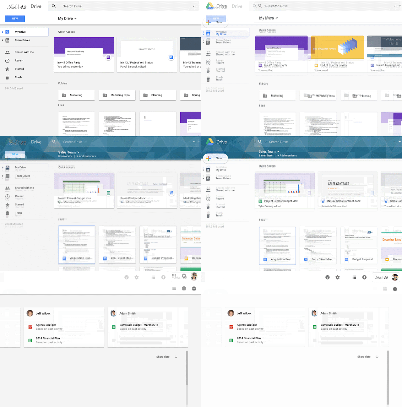
A month after revamping its Gmail web interface, Google is bringing a new look to the Google Drive on desktops. Matching its other products in the G Suite, the web client for Drive is getting a material themed interface which Google says will make it more “responsive and efficient”.
There are now rounded elements everywhere with subtle shadows, unlike its older design, making its interface brighter than usual. The “Material Refresh” which was a hot topic during the Google I/O now finds its way to the Drive and other G Suite apps.

The design changes don’t have anything to do with the way you perform daily tasks on the Google Drive. The visual tweaks come in disguise of icon remodifications and the way they’re placed on the homepage. The search bar is now accompanied by the Settings wheel and a button to access the Help Center.
There’s a pill-shaped ‘New’ button inside which the ‘+’ sign is clad in four colours that allows a user to upload a file or open a Doc, Slide or Sheet file within the interface. The Quick Access cards are also now available in rounded UI with new header fonts.
You’ll know that you’re using the updated Google Drive interface if your company’s logo is now visible on the top right. The web App background is clear white instead of grey for a brighter experience. Google has clarified that the new design will be available to all G Suite users within this week.


