With the announcement of Google Workspace, Google is revamping the icons of several apps, including the iconic envelop Gmail icon which has been there with the App since the beginning.
![]()
Google has always played with the Gmail icon in a subtle way where it has added shadows to the icon here and there but now, a total revamp of the icon is on its way. The only major icon revamp we have seen in Gmail icon till now is when Google shifted to Material Design guidelines in 2013.
![]()
With Material Design being introduced, Google made the Gmail icon look more modern with shadows and slight colour changes, but the basic theme of the icon never changed, until now.
![]()
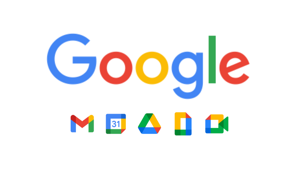
With Google Workspace, the new Gmail logo (Above) is getting four colours in its icon which are red, green, blue and yellow, shifting from the only two which it had earlier, which were Red and White. The envelope theme is now gone, and the new icon looks similar to other new icons of Google Drive, Google Docs, Google Meet, Google Calendar, etc.
Read More: What is Google Workspace?
The new icons have also received a backlash from users since it was announced yesterday. People haven’t been liking the new icon because the similarity between the new Gmail icon and other new icons is disturbingly high.
With the introduction of these new icons, it is being said that every app has lost its identity because if you look from far away, every icon looks similar with the four-colour theme, and these icons definitely follow the Google logo colours.
If we look at the situation with Google’s perspective, the change was necessary as Google was clubbing all the apps under one name (Google Workspace), so they have to follow the same guidelines for looks. But this time, Google has made the icons way too similar to each other and sadly, we can’t do anything about it but accept them.