
Google seems to be working on a redesigned material design language for Android, dubbed Material 3 Expressive. Google shared earlier this month that it will announce Material 3 Expressive at the upcoming I/O 2025 event and called it the “future of Google’s UX design.” It will feature “emotional design patterns” and new guidelines as per the company. However, the company accidentally published a blog post (now deleted) which detailed the thinking and research behind Material 3 Expressive.
Saved in the Wayback Machine, the blog post read that Material 3 Expressive was “born out of research.” “Through 46 separate research studies with hundreds of designs, and more than 18,000 participants from around the world, we’ve dialed-in a system that’s both beautiful and highly usable,” said Google in the blog post.
The company notes that Material 3 Expressive principles are rooted in solid research and built on longstanding usability best practices, so designers can confidently use these new components and principles, knowing they’re building something that will be easy to use and that people can connect with. The idea behind Material 3 Expressive, also being referred to as “M3 Expressive” or “Expressive Design,” is to “move beyond ‘clean’ and ‘boring’ designs to create interfaces that connect with people on an emotional level.”
The research was carried out through a variety of methods including:
- Usability: Seeing how quickly participants could understand and use an interface
- Eye tracking: Analyzing where users focused their attention
- Surveys and focus groups: Gauging emotional responses to different designs
- Experiments: Gathering sentiment and preferences
Google began the research with individual elements, such as “Which progress indicator made the waiting time feel faster while also looking like it belonged on a premium phone?.””We also studied how big a button can be for positive improvements in tap time without overwhelming other items on the screen,” said the company.
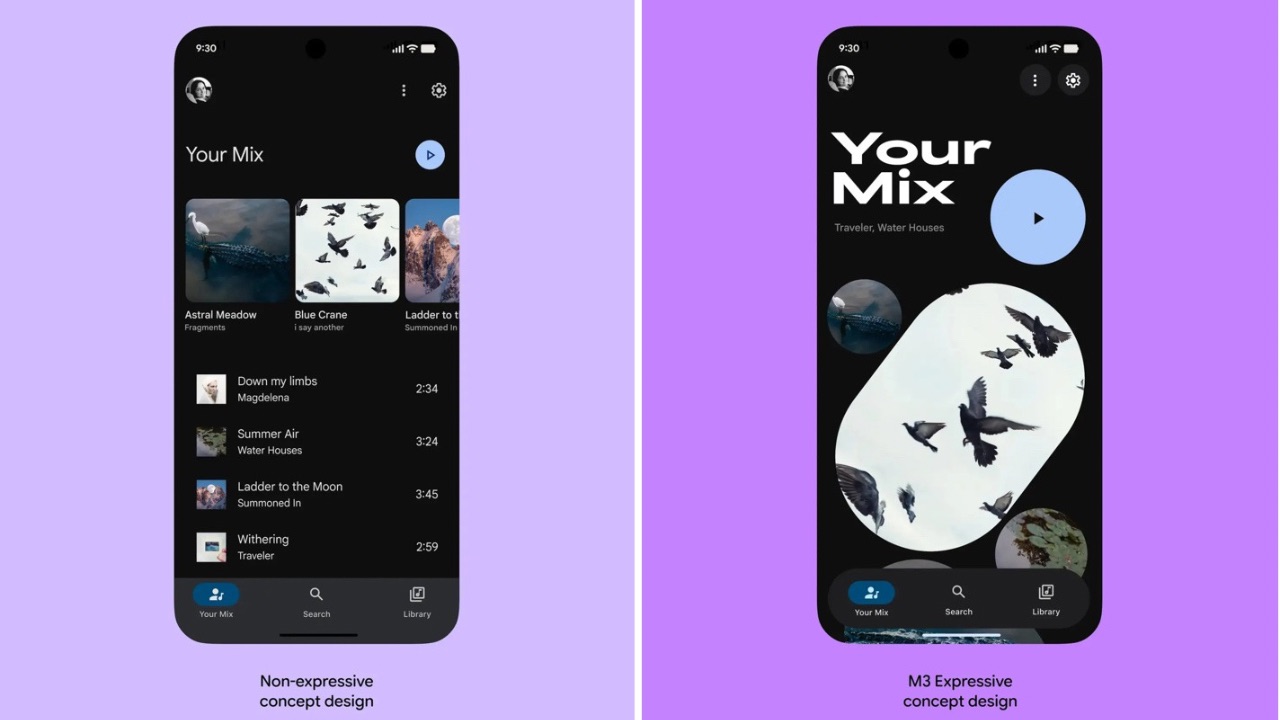
Design-wise, Google found that “well-applied expressive design is strongly preferred by people of all ages over non-expressive design that followed the iOS Human Interface Guidelines, with that preference being particularly strong—up to 87%—among 18-24 year olds.”
Read More: Google to Release a New Auto-Restart Security Feature for Android Phones
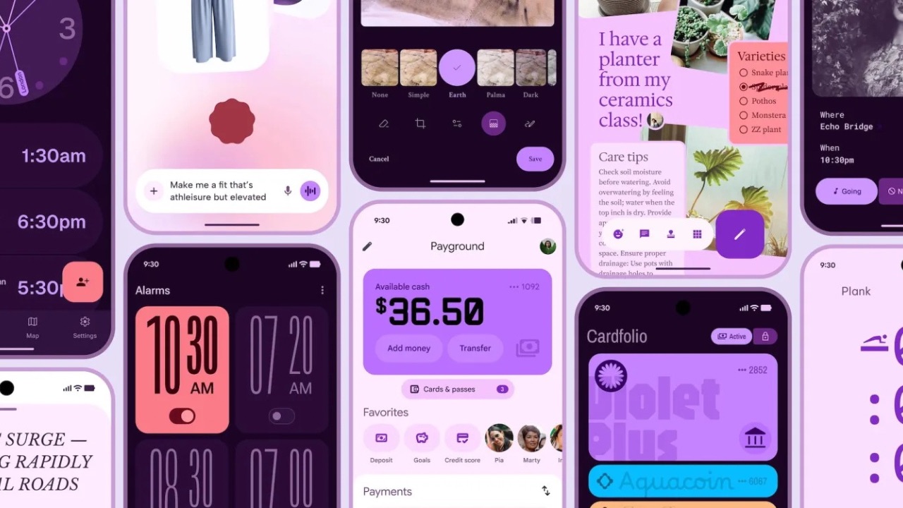
Google notes that the “fundamental parts of expressive design are the use of color, shape, size, motion, and containment.” Furthermore, “Material 3 Expressive is characterised by bold use of shape and color—creating delightful user experiences.” For example, the Send button in the new design is larger, placed just above the keyboard, and uses a secondary color to draw attention to it.
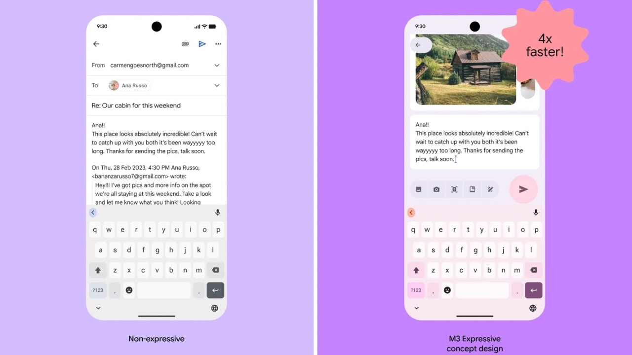
“We can compare this to the non-expressive design, which places the small Send button in the top-of-screen toolbar with other controls like attaching a file. When participants were asked to “Send the email” in the app, their eyes saw the button 4x faster in the expressive design,” said the company.
Through research, Google observed Expressive Design was found to be “more visually appealing, intuitive, and easy to use for participants with varying movement and visual abilities. Larger buttons, high-contrast visual containment, and other key attributes of expressive design make interfaces better and more usable for everyone.”
Google also noted a limitation that of Expressive design which was “lack of familiarity.” “It is also worth noting that while expressive design improved preference and usability, it was impacted by a lack of familiarity. This is a challenge that designers will have to navigate, but we expect to see familiarity increase as more and more apps adopt this new style in the next year,” said Google.